Project Overview
Harvest Light Baptist Church had just formed and needed full brand direction from the ground up. I worked closely with the client to develop a cohesive visual identity that would reflect their mission, values, and message of faith.
The goal was to create a clean, contemporary design with traditional religious symbolism woven in. Through in-depth branding discussions, we shaped a meaningful visual identity that carried through the church’s logo, stationery suite, website, and branded merchandise.
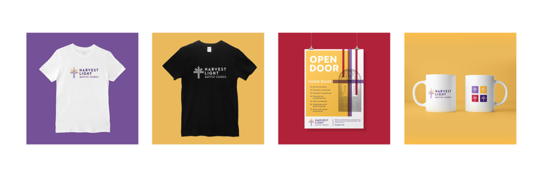
The final logo depicts a cross within threshed wheat—symbolizing that Christ is the center of the harvest, radiating abundance to all. The crimson drop pointing heavenward represents the blood of Jesus, while the color palette was selected with care based on historical and spiritual symbolism:
- Purple for royalty and the risen King
- Golden yellow for glory, radiance, and joy
- Crimson red for forgiveness and hope through the blood of Christ
The entire identity was designed to feel uplifting, sincere, and timeless.
Scope of Work
Logo Design, Branding, Stationery Suite, Website Design, eCommerce Store, Print Management
See the Results
The result was a unified brand presence that helped establish Harvest Light Baptist Church with professionalism and heart. The logo, stationery, and website all reflect their mission and values in a meaningful way.
The website features include a video header, sermon podcast integration, blog, event calendar, donation tools, and a built-in eCommerce store that allows churchgoers and supporters to purchase branded items—providing both outreach and ongoing support for the growing church.
My Role:
Art Direction, Web Design, Branding, Print Design, Print Management
Industry:
Non-Profit, Church
Year:
2018
Company:
Harvest Light Baptist Church


Similiar Projects
From concept to completion, these projects highlight my expertise in creating innovative solutions that drive results. Take a closer look at the stories behind the work.