


A sampling of some of my best logo designs from my career thus far.
Industry | Tabletop Gaming
Created | March 2019
Project Duties | Art Direction, Creative Direction, Web Design, Branding, Illustration, Social Media Design
Ink and Lyre is a husband and wife tag-team business between me (Lauren Hodges) and my husband (Daniel Hodges) that strives to create all-inclusive immersive tabletop roleplaying experiences that captivate players. The brand was created from the ground up. The end result was a cohesive brand carried through logo design, website design, and illustration.
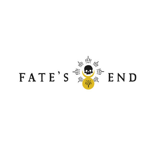
Industry | Tabletop Gaming
Created | September 2020
Project Duties | Art Direction, Creative Direction, Branding
The brand was created for the Twitch show,Fate’s End on Ink and Lyre’s Twitch Channel. In this dungeons and dragons livestream campaign, 6 individuals have drawn tarot cards, sealing their fate. What decisions will they make? Who will they meet along their journey? Fate's End is a heavy roleplay storytelling experience live play dungeons and dragons campaign with occasional combat.
The logomark itself reflects an abstract hourglass with the sand almost gone and a skull remaining in the empty part of the hourglass. The name refers to the apocalyptic storyline of the show.
Industry | Tabletop Gaming
Created | December 2020
Project Duties | Art Direction, Creative Direction, Branding
The brand was created for the Twitch show, Twisted Veil on Ink and Lyre’s Twitch Channel. This show is a Through the Breach Malifaux Tabletop RPG game where suspense and horror meet victorian steampunk.
The logomark itself speaks to the horror victorian elements of the show. The eye within the key speaks to the magical elements as well. A hidden feature of the logo can be seen from the bit of the key. As a whole, the logo can be read with the typeface of the logomark as ‘Twisted Eveil’. ‘Eveil’ is french for ‘Evil’. The text of the logo also refers to the ‘twist deck’ aspect of the game system used in this show.
Industry | Non-Profit Church
The client wanted a design with symbolism that was mainly contemporary with some traditional design aspects. This was accomplished by creating a contemporary threshed wheat design that incorporated a traditional cross design within the wheat.
This logo depicts a cross within the threshed wheat. It symbolizes that Jesus, the cross, is the center of the Harvest. From the center, He radiates the bounty that is offered to all. The red drop, pointing toward the heavens, at the top of the logo symbolizes the blood of Jesus. “...No man cometh unto the Father, but by me.”
Color Symbolism
Golden Yellow - Glory of God, Bounty, Light, Radiance, Faith, Joy
Crimson Red - Blood of the Lamb, Forgiveness, Hope, Love of God
Purple - Royalty, The Risen King
I developed this logo March 2018 as a Freelancer.
Industry | Animal/Veterinarian
The client originally requested a design that was abstract and unique. The design was created to have a unique flowy feel while maintaining the familiar paw print shape. In the end, the client decided to move forward with a different concept I had created. However, this concept was my favorite throughout the project.
I developed this logo April 2017 as a Freelancer.
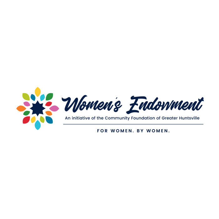
Industry | Nonprofit
Designed within the brand of Community Foundation of Greater Huntsville. The Women's Endowment is an initiative within the Community Foundation. The client wanted something that complimented the overarching Community Foundation brand, but had a feminine and professional feel that reflected the initiative.
You can see these goals are achieved by incorporating Community Foundation brand colors and pulling in an abstract 'compass star' within the center of the floral icon. The design is clean and professional with floral feminine elements.
I developed this logo October 2017 as a Freelancer.
Industry | Lumber
Russell Forest Products was established in 1978 as a provider of forest products in North Alabama. Their branding had not evolved with the company. The head of the company wanted something sleek, fresh and contemporary that would make them stand out among their competitors. Their new logo doubles as an 'R' and also gives a nod to the trees used to produce their products.
I developed this logo while I was a designer with Red Sage Communications, Inc.
Industry | Nonprofit/Community
The client wanted to update their existing brand with a logo that spoke to the heart of their organization. During our logo session, we decided the logo needed to focus on the 'Guidance' and 'Navigation' they provided to other non-profits. Therefore, the final design evolved into a compass logo. Each color used represents a different community sector within the organization.
I developed this logo March 2017 as a Freelancer.
Industry | Nonprofit/Education
The client wanted to update their existing brand with a logo that spoke to each local sector they served. During our logo session, we decided the logo needed to be bright, colorful, and focus on the 'Advocacy', 'Partnerships', and the 'Stability' they provide. Therefore, the final design is clean, crisp, and symbolizes people coming together in unity. Each color used represents a different school sector within the organization.
I developed this logo November 2017 as a Freelancer.